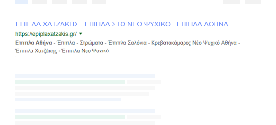
Κατασκευή Ιστοσελίδων με μοναδικό DESIGN & SEO από τους ειδικούς
Η WEB-INFOX ίσως νομίζετε πως είναι άλλη μια εταιρία κατασκευής ιστοσελίδων όπως όλες οι άλλες. ΔΕΝ ΕΙΝΑΙ!! Δραστηριοποιείται, όπως όλοι οι άλλοι, στην κατασκευή και διαχείριση ιστοσελίδων και e-shop, με τη διαφορά ότι έχει περάσει σε άλλο επίπεδο. Η εταιρία μας ειδικεύεται στην κατασκευή ιστοσελίδων, e-shop και σελίδων στα social media, δίνοντας μεγάλη έμφαση σε όλους τους τομείς που πλαισιώνουν τη διαδικασία του internet marketing και του social media marketing όπως σχεδιασμό, προώθηση, βελτιστοποίηση αλλά και υπηρεσίες επαγγελματικής κειμενογραφίας.
Υπηρεσίες γραφιστικής
Η οπτική επικοινωνία με τον πελάτη αποτελεί τη βάση για κάθε είδους μάρκετινγκ και είναι ένα από τα θεμελιώδη στοιχεία που καθορίζουν το κύρος και τη φήμη ενός εμπορικού σήματος ή μιας εταιρίας. Το λογότυπο και η ονομασία αντιπροσωπεύουν την πρώτη μορφή επικοινωνίας και το χαρακτηριστικό σήμα μιας εταιρίας. Η Web-Infox δημιουργεί ολοκληρωμένες λύσεις ταυτότητας επωνυμίας: από την ονομασία και το σχεδιασμό λογοτύπου μέχρι τη συντονισμένη εικόνα (φυλλάδια, κατάλογοι, επαγγελματικές κάρτες, κοινωνικά μέσα κτλ.). Το μυστικό κάθε πετυχημένου brand είναι η συνάφεια και η σύνδεση με το προϊόν ή την υπηρεσία που παρέχεται. Η ταυτότητα της εταιρίας μεταδίδεται στους πελάτες μέσα από την εικόνα που προκύπτει. Η Web-Infox διαθέτει την εμπειρία και την τεχνική κατάρτιση ώστε να σχεδιάσει την εταιρική ταυτότητα ξεκινώντας από την αφήγηση του πελάτη και προσπαθώντας να συνθέσει σε ένα λογότυπο ή σε μια αφίσα όλη την ψυχή μιας εταιρίας. Τα λογότυπά μας είναι λιτά, άμεσα, αποτελεσματικά και υψηλής ποιότητας.
Σχεδιασμός ιστοσελίδας
Έρευνα
Συλλογή δεδομένων
Στόχευση
Αποτέλεσμα
Γιατί να προτιμήσετε τη Web-Infox για τη δική σας ιστοσελίδα
Όταν επιλέγετε μια εταιρία για την κατασκευή της ιστοσελίδας σας είναι σημαντικό να μην παρασύρεστε από εταιρίες που προσφέρουν δήθεν κατασκευή ιστοσελίδων σε πολύ χαμηλές τιμές. Η εταιρία στην οποία θα εμπιστευτείτε την κατασκευή της ιστοσελίδας σας θα πρέπει να είναι αξιόπιστη και οι ειδικοί της να διαθέτουν την τεχνογνωσία, ώστε να φέρουν εις πέρας το έργο που τους αναθέτετε. Ας δούμε, λοιπόν, σε τι διαφέρει η Web-Infox από άλλες εταιρίες κατασκευής ιστοσελίδων και γιατί σας συμφέρει να την επιλέξετε.
Η προώθηση και βελτιστοποίηση ιστοσελίδων (SEO, Search Engine Optimization) είναι όλες οι σύγχρονες τεχνικές κι ο κώδικας που χρησιμοποιούμε για την προώθηση ιστοσελίδων, ώστε να καταφέρουμε να φέρουμε ένα website σε μια υψηλή θέση στα οργανικά αποτελέσματα των μηχανών αναζήτησης όπως Google, Yahoo, Bing, MSN, Baidu κ.ά. Η προώθηση της εταιρικής σας ιστοσελίδας και του ηλεκτρονικού καταστήματός σας στις μηχανές αναζήτησης καθορίζει την εικόνα της επιχείρησής σας στο web. Οι λύσεις που προσφέρουμε εμείς στη Web-Infox είναι μοναδικές γιατί πιστεύουμε ότι οι πελάτες μας είναι μοναδικοί κι έτσι θα πρέπει να παραμείνουν. Για αυτό η Web-Infox σχεδιάζει μοναδικές, εξατομικευμένες στρατηγικές SEO (Search Engine Optimization). Η προώθηση ιστοσελίδων πετυχαίνει το επιθυμητό αποτέλεσμα φέρνοντας γρηγορότερα περισσότερα αποτελέσματα στην πρώτη σελίδα οργανικών αποτελεσμάτων των μηχανών αναζήτησης. Το SEO για την προώθηση ιστοσελίδων είναι μια αρκετά πολύπλοκη διαδικασία που απαιτεί πολύ χρόνο και τεχνογνωσία αλλά εμείς διαθέτουμε την εμπειρία ώστε να το πετύχουμε.
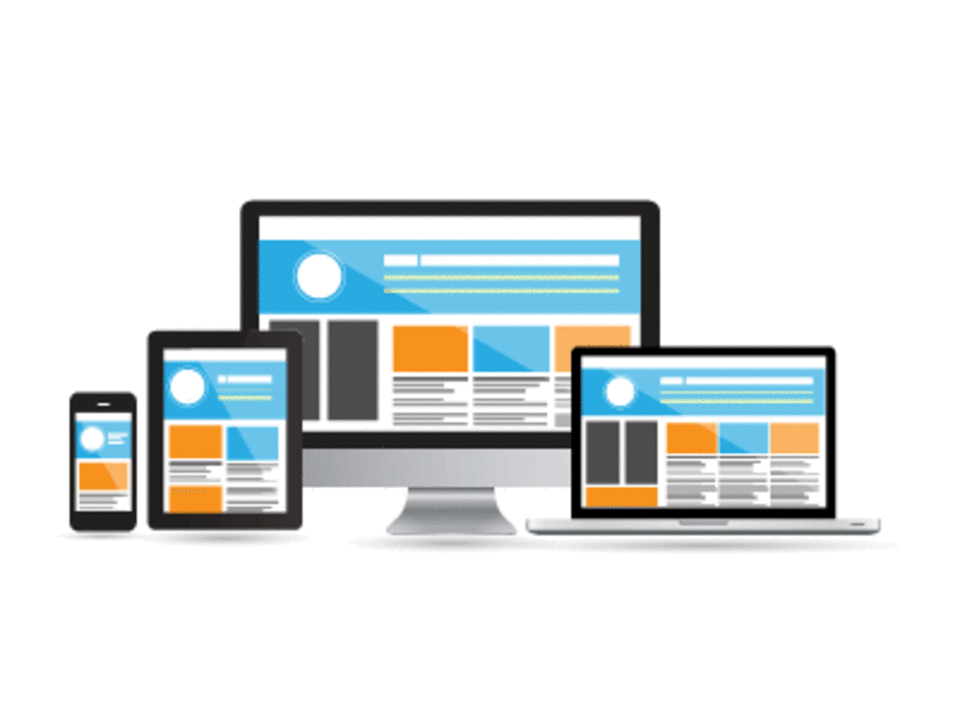
Websites with a responsive design suitable for mobile devices
Responsive Web Design derives from the word “respond” and it means that a website corresponds and adjusts to the screen analysis of the device where it loads.
This means that if someone visits a responsive website on his smartphone or tablet, the website will adjust in such a way that it will not require any zooming in or scrolling to easily read its content.
By using a responsive web design, a website can operate as a web application when it loads on a mobile device such as an iPhone, an iPad, an android, a blackberry etc. This is very important because the last few years we have observed a significant increase in users that surf the internet via mobile devices.
Advantages of a Responsive Web Design
Making navigation easier for the visitor
In a responsive website the visitor doesn’t need to continuously zoom in so as to read the content. In general, the navigational environment is more pleasant and user-friendly.
Easy updating by the administrator
Contrary to the simultaneous existence of a website for computers and another version of the website for mobile devices, a responsive design makes the administrator’s job easier as he doesn’t have to update two websites but he makes any changes that he wants directly to the main website. This saves a lot of time and unnecessary costs.
Proper usability can increase the time that a user spends on the website
When a user visits a website from a mobile device, he won’t stay long if the website causes him distress. On the contrary, if a website is responsive, there are more chances of him navigating through all the available services and products.
Η ταχύτητα σε κινητές συσκευές είναι ένας σημαντικός παράγοντας για μια καλή κατάταξη στις μηχανές αναζήτησης και η αύξησή της θεωρείται μείζονος σημασίας.
MOBILE MARKETING
Ψηφιακό μάρκετινγκ σε πολλά κανάλια με στόχο την προσέλκυση πελατών που χρησιμοποιούν κινητές συσκευές.
MOBILE SHARING
α κοινωνικά δίκτυα σας βοηθούν να ανεβείτε στις κατατάξεις των μηχανών αναζήτησης. Η ανταλλαγή link μπορεί να βοηθήσει περαιτέρω σε αυτό.
MOBILE DESIGN
Η φορητή σχεδίαση, η ευκολία χρήσης και η διεπαφή για κινητές συσκευές θα βελτιώσουν την επισκεψιμότητα και θα αυξήσουν τις πωλήσεις.
MOBILE SEO
Ταχύτητα απόκρισης σε κινητές συσκευές με μια εύχρηστη διεπαφή φιλική προς τον χρήστη που θα σας βοηθήσει να ταξινομηθείτε υψηλότερα και να έχετε περισσότερες πωλήσεις μέσω κινητού.
MOBILE SITE AUDIT
Κώδικας εξειδικευμένων αλγορίθμων μηχανών αναζήτησης για να πάρετε υψηλότερη βαθμολογία και να αποκτήσετε περισσότερους επισκέπτες.
Όλο και περισσότερες ιστοσελίδες δέχονται επιθέσεις από κακόβουλο λογισμικό που επηρεάζει τη λειτουργικότητά τους και πολλές φορές καθιστά ανέφικτη την επαναφορά τους. Υπάρχουν ...
Μια ιστοσελίδα για να μπορέσει να λειτουργήσει σωστά και αποτελεσματικά είναι σημαντικό να διαθέτει μια καλή φιλοξενία (hosting). Θα λέγαμε ότι η φιλοξενία είναι τα θεμέλια της ...
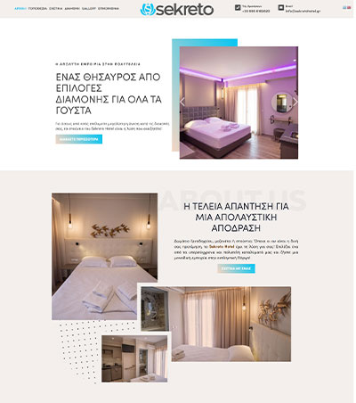
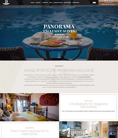
Κάθε επιχείρηση εστίασης χρειάζεται τη δική της ιστοσελίδα
Είναι πλέον ξεκάθαρο σε όλους ότι όλο και περισσότεροι άνθρωποι στρέφονται στο διαδίκτυο για να αναζητήσουν κάθε είδους υπηρεσία ή προϊόντα. Ο χώρος της εστίασης δεν αποτελεί εξ...


